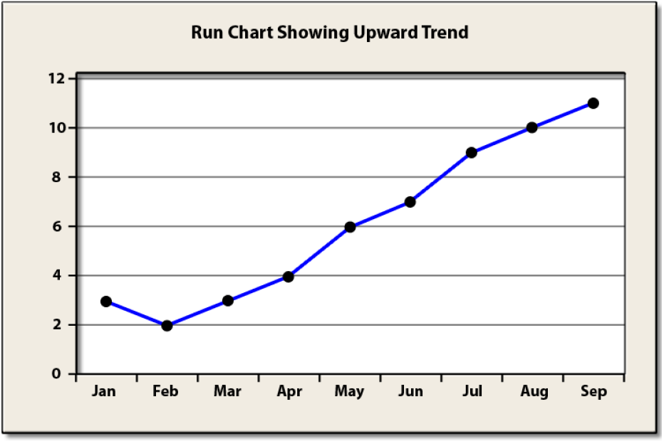
A Run Chart is a basic graph that displays data values in a time sequence (the order in which the data were generated). A run chart can be useful for identifying shifts and trends.
Example: A supervisor of a customer service center collects data on the number of complaints that are filed each month. Data for the last several weeks are shown below.
A Run Chart for this data is given below.
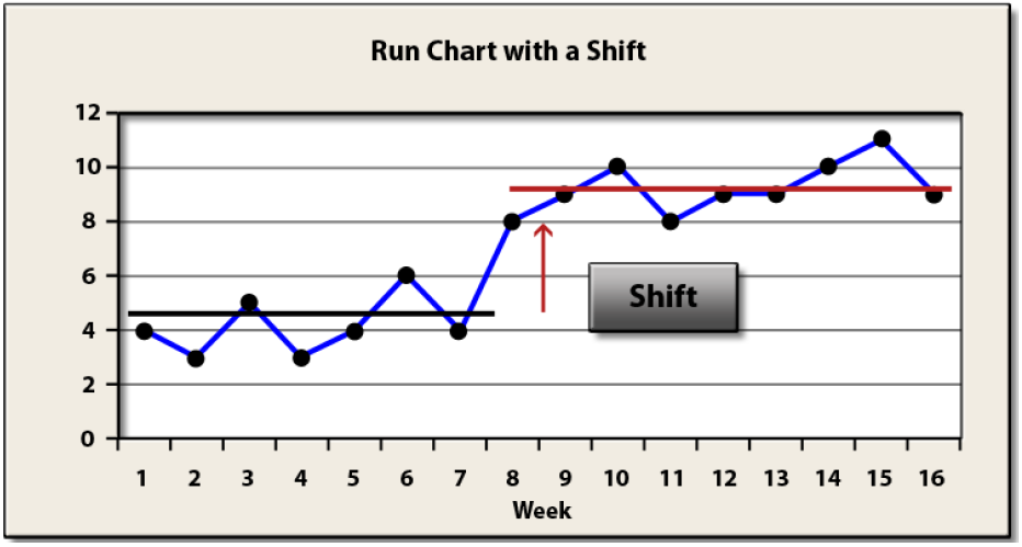
The run chart shows that for the first seven weeks, the number of complaints moved up and down around an average just above four. However, for the last several weeks, the number of complaints has shifted upward and now moves up and down around an average of about nine. The overall average number of complaints for the sixteen weeks is about seven. A general rule of thumb is when seven or eight values are in succession above or below the average of the group, a shift has occurred. This is like flipping a coin and seven times in a row it comes up heads or tails. Could it happen randomly? Yes, but not likely.


