The choice of Cell Intervals (the number and width of the classes used to construct a histogram) can have an effect on the shape of the histogram. In general, a smaller number of intervals results in a less distinct shape, while a larger number of intervals can reveal unexpected patterns.
Note: Please refer to the other topic on cell intervals for more information about rules-of-thumb in regard to cell choices.
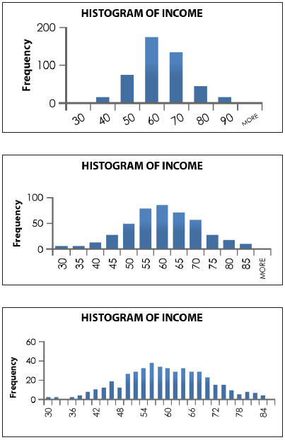
Example: A random sample of n = 400 people in a small town were asked to state their most recent annual income. The researchers decided to display the data with a histogram. The annual incomes vary from $30,000 to $84,000. Unsatisfied with their initial histogram, they increased the number of cell intervals. See the results below.

While each of the histograms indicates the data might be bell-shaped or normally distributed, as the class size increases, there is more refinement in the shape of the data. The middle histogram appears to indicate the data is quite clearly normally distributed. However, the last histogram (which has the most number of cell intervals) indicates another peak in the data around $66,000 or $68,000.


