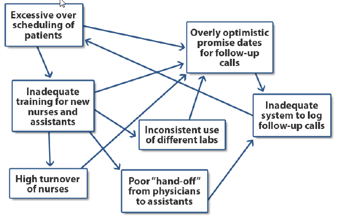
An Interrelationship Diagram shows graphically the cause-and-effect relationships that exist among a group of items, issues, problems, or opportunities. It is particularly useful in helping to identify the potential causal relationships that might lie behind a problem that continues to recur despite attempts to resolve it.
Example: A local physicians’ group is experiencing a relatively high number of patient complaints regarding the lack of returned phone calls following a patient visit where some kind of test was ordered. In particular, the patients are frustrated that the promised call notifying them of the test results is either delayed or must be initiated by the patient. The office manager of the group conducts a brainstorming session to generate potential reasons for the lack of effective and timely follow-up calls. The group then takes the brainstormed list and organizes the potential reasons using an interrelationship diagram.
The basic idea is to count the number of “in” and “out” arrows to and from a particular issue and to use these counts to assist you in prioritizing the issues. In the interrelationship diagram above, “Overly optimistic promise dates for follow-up calls” is a key issue and, of course, would cause patients to expect a phone call faster than the group believes it can deliver it. However, do not summarily ignore or devalue the importance of issues with few “in” and “out” arrows until you have verified empirically the influence of these issues.

