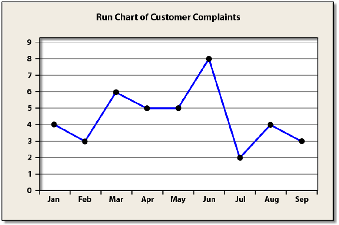
A Run Chart is a basic graph that displays data values in a time sequence (the order in which the data were
generated). A Run Chart can be useful for identifying trends or shifts in process.
Example: A supervisor of a customer service center collects data on the number of complaints that are filed
each month. Data for the last several months are shown below.
A Run Chart for this data is given below.

Note that the data appear to “move around” with an average of about four complaints filed per month and
there are no obvious trends (sequential moves up or down) present.

